Logging In

A few weeks back I penned a discussion regarding a number of noticeable technical divergences we’re seeing the in current market environment.  How these resolve will be important over the short term.  Now that the debt ceiling decision has been forestalled, the markets are basking in the knowledge tapering is clearly off the table for the foreseeable future.  Very expedient political decision making in front of the 2014 mid-term elections, I must say.  How much further will the markets run on the discounting of no tapering, or is this now in price?  In this discussion I want to look at a number of chart patterns whose resolution will perhaps be very important from an intermediate and longer term standpoint.  And it just so happens these patterns are singing in multi-part harmony exactly as the markets are now assured of no tapering any time soon.  Quite the interesting juncture between sentiment and price.

Before looking at the charts, a quick comment.  To the point, below is a look at some very long term charts of the major and most popular equity indices.  Very simple stuff.  But what I’m showing you is a bit of a curve ball.  The top graph in each clip is a log scale view of life for that equity index, while the bottom clip is non-log.  The important issue is that in each case I’m looking at the long term history of rising tops in each index.  As per the logarithmic charts, we’re not quite there yet in terms of hitting these rising tops lines of significance.  But when looking at the same index in non-log terms, we’re either sitting right on top of a very long term resistance/breakout line, or we have already modestly risen above the historical series of rising tops.  The last issue of importance is that these patterns are completely consistent across all of these major indices.  Does that speak to the commoditized character of equities relative to alternative global assets classes of the moment (that are underperforming)?  Regardless, I believe these charts are more than deserving of our monitoring as we move ahead.

Let’s look at the charts as they tell their own stories and I’ll finish with a few comments.

dow1013

As a quick aside, I could not help but notice monthly RSI has so far put in a series of lower highs at each major nominal price top over the last decade plus.  We see this in a number of the indices below along with a few flat line triple top RSI patterns of the moment.  At least for the Dow, this is just about as textbook a broadening top formation as one is likely to see in terms of long term price.  Again, the individual log versus non-log chart proximity to the rising tops line is clear.  You’ll see exactly the same in the charts below.

trans1013

The mid and small cap indices lay below:

mid1013

(So far all the charts above show us the declining tops RSI line, but that’s about to change.)

russell1013

I’ll end with a quick look at the NASDAQ that does not share near exact rising tops price experience since 2000, as we all know.  But a rising tops formation since late 2003 to present is relevant.

comp1013

I’ll keep the closing commentary short as I’m more than sure you get the picture (no pun intended).  We’ve seen a number of strategists and pundits talk about the end of the 2000-present secular bear in equities and the beginning of a new secular bull.  I would suggest that for those even contemplating such an outcome, monitoring the charts above is critical.

Very quickly, I personally believe breakouts to the upside, if they occur, could be signaling something other than a new secular bull mostly because for now we just do not have the type earnings growth normally associated with secular bull awakenings.  Alternatively, breakouts to the upside could be telling us a true bubble in US equities is beginning to form.  I do not mean this to sound pessimistic by any means.  As always, what is is.  Rather, if it is to occur, I personally believe it will be driven by a near historic lack of acceptable alternative investments in a world both awash in liquidity and intentionally starved for rate of return in safe investment vehicles by central bankers.  Remember, at the equity peaks in 2000 and 2007, believe it or not even money funds offered more than acceptable rate of return refuge.  No longer.  A potential US equity bubble would be driven, in my mind, by a growing and near historic sense of “nowhere else to go” with global capital (that is scared of debasement and confiscation).

As simpleminded as this may sound, it’s either very important price breakouts or breakdowns ahead.  And given the relatively commoditized nature of equities as an asset class for now (don’t strikingly similar chart patterns suggest as much?), I would expect either breakout or breakdown outcomes to be consistent across the entire group.  Given my impeccable historical track record of being 100% unable to exactly predict the future (it’s just a good thing I’m in the very good company of other human beings on planet Earth), I’m need to wait and see where price travels from here.  My suggestion to you is to keep the very long term charts on your radar.  This is not a time to let personal ego get in the way of respecting market messages.

Diverging View Points

Personally, I think even attempting to call a top on this character of an equity market is an exercise in the self-infliction of pain for now.  It has been a long time since I’ve seen this type of speculation, but it’s been never since I’ve seen this type of monetary largesse.  Moreover, when was the last time both the Fed and politicians have meaningfully attempted to “shape” societal perceptions, let alone hoped for economic outcomes, via manipulation of the financial markets?  We know capital is “concentrating” right now, and the repository is US and large global equities.  The Fed has been 100% successful in forcing capital into equities and real estate, exactly as their years ago game plan detailed.  Likewise, with the tapering genie now out of the bottle, we are watching a rescission of global capital that originally spread out across planet Earth as QE went to ever greater heights since 2009.  The outgoing tide is now coming in.  These two forces, domestic investment concentration in one asset class and an incoming tide of liquidity from broader global risk assets (think emerging markets, commodities and the metals) characterizes the moment.  And for now, liquidity and the weight and movement of global capital trump strict fundamentals.  Nothing new, we’ve been here before.

But a funny thing happened on the way to new equity highs recently, for the first time in many a moon we’ve begun to see more than a few noticeable technical divergences.  Remember, technical analysis is a suggestion, not a hard and fast mandate.  It suggests to us what might be, as opposed to definitively speaking to what will.  Technical signals, especially in this character of a market, can change meaningfully and fast in both directions.  A lot of tried and true historical “systems” have simply broken down for now.  After all, technical analysis is tough enough in a free market environment, let alone the type of one in which we now find ourselves.  As always, adaptability is essential for survival.

I promise, the last thing I’m trying to do in this discussion is call a top.  This is merely an attempt to provide perspective.  I’ve seen many a market that was a “no lose” environment…until the losses started.  I’ve seen markets where complacency reigned for an extended period…until it didn’t.  You know the routine.  So rather than pontificate about where equities are headed next, primarily because I have no idea (and neither does anyone else), I thought I’d simply let a number of charts do the talking.  Again, perspective, not predictions.

One very apparent divergence we’re seeing right now is the NYSE advance/decline line relative to the S&P itself.  The cumulative AD line has been in a range since mid-May, while equities have journeyed to recent new high territory.

nyad

Believe me, I’m fully aware of the fact that the NYSE is polluted with a ton of fixed income proxies or surrogates.  Makes a lot of sense that the cumulative AD line has been in a trading range since mid-May as this was when the rumblings regarding tapering began, certainly impacting fixed income and surrogates.

But I think it’s also important to remember that in the period leading up to the 2007 equity market peak, it was credit that was first in trouble, then came equities peaking followed by commodities.  Interestingly before the final equity market peak in 2007 (a lower high on the cumulative AD line), the cumulative NYE AD line when into a good bit of a trading range between mid-May and late July, diverging from equities themselves.  Again, just perspective.

nyad07

Next up is a quick look at the Summation index.  Briefly, the Summation index is really a running total of the McClellen Oscillator (measuring net advances).  Simply, it’s another perspective on breadth.  At least over the past year or so, whenever the Summation Index has dipped below the 600 mark, we’ve either been in or about to start at least a 5% equity correction.  Not this time…so far.  This is the longest period of time we’ve stayed below that demarcation line over the past year and yet still not even a minimal 5% correction.

nysi

Just for fun, what was the setup in ’07?

nysi07

Continuing tangentially with this theme of breadth, let’s have a look at the S&P bullish percentage index.  English translation?  The percentage of stocks in the S&P on point and figure buy signals.  For now, it’s a clear declining tops formation again dating back to that fabled month of May when Fed minions started yacking about tapering.

BPSPX

The 2007 version of BPSPX life?

BPSPX07

Not an exact match by any means, but one has to admit it’s rhythmically similar to what we see today.  All of the three sets of charts above deal primarily with breadth.  They deal with participation.  The Summation Index and the Bullish Percentage indicator are telling us that individual equity participation at each new recent high in the S&P since May has diminished in sequential fashion.  Participation has narrowed.  Often a classic precursor fingerprint preceding meaningful market peaks, but unfortunately in the elusive ways of the markets there is zero indication of timing when or where that peak may occur, if ever.  How’s that for definitive?

Three more quick charts that also deal with the issue of level of participation among equity index constituents.  Pretty simple stuff, below is a look at the percentage of S&P stocks above their 50 day and 200 day moving averages in the following two charts.

50DAY

I’ll spare dragging you through the 2007 comparatives where we likewise saw similar divergences.

200DAY

As one might expect, the message of the two charts is consistent – lower levels of total participation at each iteration equity peak since May.

One last look at broad market participation from yet another lens of the level of equities achieving new highs.  Below you will see a massive spike in NYSE weekly new highs early this year.  Not unexpectedly, it occurred alongside the breakout of the S&P to new all-time highs.  Yet since that time as the nominal S&P has floated higher, the number of new weekly highs has plunged to levels last seen when the S&P was near 1400.  I’ve marked in the chart a number of other periods over the last ten years where we’ve likewise experienced a quick drop in the number new weekly highs.  These were associated with 5-10% corrections (admittedly it was a good bit worse moving into early 2008.  This time around, no 5-10% correction, at least not yet.

NYHGH

Enough.  So there you have it, a number of diverging market points of view that have developed in multi-part harmony over the last six months.  Rather than making guesses about what is to happen to equities ahead, I think the key message here for asset managers is one of respect.  Until these divergences are cleared up, if you will, we need to respect the dictate of risk management.  Every technical divergence is not a message to run for the hills.  But when a multiplicity of divergences appear, it’s a loud message to heighten risk management strategies until there is clear resolution of these divergence in one direction or another.

The Taper Chase

In June of this year Fed Chairman Bernanke first publicly discussed the possibility that the Fed would begin “tapering” their Quantitative Easing program somewhere in the near future. Since that time, conflicting commentary from Fed members and hangers on have kept investors guessing as to actual policy outcomes. In addition, Fed commentary alone had caused real global capital to recede from QE beneficiary risk assets such as emerging market equities, bonds and currencies as well as precious metals, commodities and developed economy fixed income vehicles. Although the Fed assured markets their potential QE tapering actions would be incremental, investors have a funny way of discounting tomorrow today.

We know now that when mighty “Casey” Bernanke stepped up to the plate on that fated Wednesday that was September 18, he adjusted his stance, surveyed the playing field and he took a mighty swing…and a miss. No QE tapering on this fine day. Since his original June speech, the capital markets had priced in a September tapering. It had become consensus thinking among investment strategists. The San Francisco Fed had even produced a white paper just weeks before the September Fed decision supporting the view that QE has been largely ineffective in stimulating actual GDP growth. To their credit, the Fed had successfully shaped market perceptions and behavior to expect the beginning of the wind down of what has been an extraordinary, very controversial and historically unprecedented period of US monetary policy. It was the perfect time to deliver the first tapering pitch. Yet at the last minute the Fed decided to throw the markets and investors a monetary curve ball. So much for Fed transparency, clarity and consistent forward guidance for now.

Just what has the Fed really accomplished by postponement? Why might they have taken a pass on tapering their money printing and bond buying now?

I personally believe tapering postponement buys the Fed very little. But from the start, the Fed has told us they were “data dependent” in terms of the tapering decision. In truth, from the standpoint of data alone, postponement actually makes some sense. Payroll employment growth has not exactly been gangbusters as of late and neither has headline GDP growth – both perceptual Fed targets for improvement at the outset of QE3.

Yet we know that the unspoken truth on the Street is certainly that the unemployment number has been skewed in the current cycle by the labor force participation rate, bringing into question the targeting of the unemployment rate in the first place. The chart below is quick look at the history of what is termed the labor force participation rate. What it tells us is the percentage of the population in the total US labor force – those actually working and those looking for work. The clear anomaly for some time now has been the dramatic fall in this number.

laborforceparticipation

Importantly, we need to remember that when folks no longer receive unemployment benefits, they are no longer counted in the official labor force numbers. The labor force count at any time is the denominator in the employment rate relationship that measures those with a job as a percentage of the total labor force. All else being equal, when folks fall off the unemployment benefit rolls, the labor force count falls, the employment rate ratio rises and the unemployment rate falls – none of this having anything to do with actual jobs being created, but rather a lot to do with those losing longer term unemployment benefits.

Just why is the labor force participation rate falling? At least in meaningful part, structural unemployment. We see this directly in the low skilled labor pool. A number of jobs simply disappeared in the last recession for those with low skills. Those working part time due to inability to find a full time job is near new highs for the current cycle. The number of weeks out of work for those who find themselves unemployed is today higher than any recession peak of the last three decades. Point being, it is more than widely known that the unemployment rate itself is a very controversial number in terms of accurately characterizing US labor market slack, yet it is supposedly a headline Fed QE decision making barometer. In one sense, the Fed is shadowboxing an illusion. Question being, how will the continuance of full on QE 3 for a number of additional months change the reality of the current US labor market?

For now, much the same can be said for the macro economy itself. I won’t dwell on this as the numbers are more than well known. The current cycle has consistently shown us the slowest quarterly GDP growth on record for a continuous economic expansion cycle. Not once have we yet been able to achieve 4% annualized real growth in any one quarter – a record over the history of US GDP data

realgdp

Since the Fed started QE3, growth rates in both payrolls and headline GDP have slowed. Rationale for a postponement of QE tapering? Sure. But again, what will additional QE spark in hoped for acceleration in labor markets and the general economy that the first $3 trillion in QE over the past five years has not already? Exactly what does the Fed accomplish by postponement?

Switching gears a bit, if we believe the ability of QE to meaningfully impact payrolls and GDP over the short term is relatively small, exactly why may the Fed have passed on tapering QE in September?

I personally have two answers hopefully closer to the heart of the moment – interest rates and the debt ceiling political melodrama in which we now find ourselves. It’s a good bet Bernanke and the Fed got a bit more than they bargained for with May rumblings of tapering and the actual mid-June Bernanke tapering dialogue in terms of interest rate movement recently. The ten year US Treasury yield lofted from 1.6% to just over 3% during the May to August period. Importantly, the 10 year Treasury yield is the reference rate against which most 30 year conventional mortgages are based. Conventional 30 year mortgage rates rose to 4.75% in late August from 3.5% or lower in May. This was certainly something the Fed did not want to see as housing has been one of the economic bright spots as of late.

It is interesting to note that the FOMC commentary with the no taper decision began by citing “tightening financial conditions”. At the time, the stock market was near an all-time high, certainly not a “tight” financial condition. In recent quarters we had seen the Fed sponsored Senior Bank Lending Survey show us the easiest of lending conditions for banks over the current cycle to date – certainly not tight. Undoubtedly, the Fed was referring to what had occurred with the general level of interest rates since their tapering commentary began. The taper trial balloon the Fed had allowed to ascend skyward caused a real world reaction in interest rates certainly not to their liking.

Again, what does forestalling QE tapering now mean to forward interest rates? Will bond investors be more accepting of tapering in the future, without sparking such a violent reaction in rates to the upside? The fact is that QE 1,2, Operation Twist, and QE 3 have been in operation over 91% of the time since late 2008. What began as an emergency operation 5 years ago has now morphed into a program of ongoing subsidization. We know the Fed has been the dominant buyer in Treasury and mortgage backed markets for some time. Key question being, will natural bond buyers return to the fixed income markets when a return to free market pricing has been further delayed by Fed inaction? Natural buyers will not return until they can be assured of non-interventionist pricing. We’re still a long way away from such a market environment.

Finally, it’s also a darn good bet the Fed chose to stand down in September due to the debt ceiling political theatrics we have again been treated to in recent weeks. Bernanke directly mentioned that “Federal fiscal policy continues to be an important restraint on growth” in his comments. Tax rates are going higher amidst a slow growth economy. Moreover, components of the Government sequestration process agreed to in early 2013 become effective in early 2014 – there are more Government cutbacks to come that will add up to just shy of 1% of GDP. Of course the irony is that the current debt ceiling debate does not address any of the very important longer term fiscal issues that face the US such as Medicare funding and other booming social costs that lay ahead – these issues are not even on the table.

As investors we simply need to realize that lack of clarity from the Fed may be with us over the remainder of the year and into next. Conflicting Fed commentary has only continued post the no tapering decision. It is generally believed that Bernanke will retire from the Fed in January of next year, but that means that we’ll need to see the President nominate a new chairperson, they will have to be vetted and the Senate will need to approve the nomination all in the next ten weeks (prior to holiday recess). We also have another FOMC policy meeting in December. (I’m assuming the October meeting will produce zero change in policy.) Short term market volatility around these events would be more than understandable.

Yet longer term the question of a wind down and ultimate termination of QE is not going to simply fade away. What began as a needed emergency shot of adrenaline to the heart of the economic patient in late 2008 has now become a continuous IV drip the academicians at the Fed for now deem unacceptable to moderate, let alone remove. QE has been a “subsidy” to both the economy and financial markets. Do Fed policy makers really expect a quiescent market reaction to the potential removal of THE key subsidy of the current economic and financial market cycle? Of course the answer to that question lies somewhere in our now data dependent future.

If You Plant Ice, You’re Gonna Harvest Wind

As you know, we all await the Fed word from on high this Wednesday. Will they or won’t they? As always, the most important part of the equation will be the market reaction to whatever happens. Personally, regardless of nominal dollar tapering or otherwise, I expect the Fed to be quite the dovish bunch in terms of commentary. Can they light the markets up regardless of outcome? Look, when a possible Fed Chairman contender who bows out of the race even prior to being officially part of the game can light up financial assets, anything can happen.

Again, although I personally expect cooing and soothing “forward guidance” from the Fed, it’s a very good bet the end game for QE has begun. Why? Just have a look at the following table.

economic data

Of course September of 2012 is when QE3 began. And this is mission accomplished in terms of an accelerating economy? Purely academically, do these numbers support tapering? In so many data points above, decelerating growth to flat at best growth is the character we see. If the Fed’s true intent was to create escape velocity in the US economy, the last thing they would do right now is taper. They know QE is not meaningfully impacting economic acceleration. Don’t get me wrong, it’s helping to maintain growth, but acceleration anywhere even close to historical precedent has remained elusive for the entirety of the current cycle. In fact the acceleration we have seen in GDP in the last few quarters is virtually solely due to inventories. I won’t go into the multiplicity of reasons why Fed tapering will occur as we could spend all day on the subject. From no wealth effect realization to meaningful financial market distortions to less Treasury issuance ahead, the Fed knows the costs and the risks (financial bubbles) of further QE are outweighing the less than hoped for positives.

Throughout the third quarter of this year, investors have become increasingly nervous regarding forward Federal Reserve monetary policy, and for good reason. From the time QE (Quantitative Easing) 1 first started in November of 2008, the Fed has been implementing QE 1, QE 2, Operation Twist and QE 3 in 53 out of 58 months over this period – 91.4% of the time. To suggest that investors in the fixed income markets had gotten used to, relied upon, levered up, and positioned exactly for Fed stimulus to continue is an understatement. Yet we need to remember that Fed monetary policy has influenced global financial markets far beyond simply US borders. Yes, we know Fed decisions will influence US financial markets, but what about the global economy and financial markets in what is an increasingly interdependent world?

In one sense, the Fed created an ice age for US interest rates by lowering the Fed Funds rate essentially to zero and by printing money to buy US Treasury and mortgage backed securities, putting further downward pressure on longer term interest rates. By design, the Fed wished to push investors into higher risk assets such as equities and real estate by lowering the return on safe bond investments. In the US, the Fed accomplished this goal as equities levitated despite lackluster economic and corporate earnings growth. Likewise, investors have turned to real estate investments in the hunt for rate of return that had vanished from the world of bonds.

But as the Fed printed ever more money to buy bonds, they created increasing amounts of liquidity that ultimately spilled over into global financial markets beyond US equities and real estate. In recent months emerging market equities and currencies have been under more than noticeable pressure. I’m referring to Brazil, India, Indonesia, Thailand, South Africa, Turkey, as well as a host of others. In addition, emerging market currencies and bond markets have likewise not been kind to investors. Although US equities have shown us double digit gains this year, an investor in an asset like the Vanguard Emerging Markets fund has lost 14% of their money on a price basis through August. In fact over the last six months, not one of the equity markets in the MSCI Emerging Markets Index beat the MSCI World Index. The last time this happened? Almost 13 years ago. Quite the juxtaposition in global equity performance, but understandable when one considers the prior period global spillover of Fed QE into the global asset markets all in the search for higher rates of return in a period that had become an ice age for nominal US interest rates.

Now that Fed “tapering” of QE is a process the markets are starting to price in and the fact that this tapering will continue at some pace until QE is ultimately terminated, glacial or otherwise, again it’s not just US assets that will be affected in the rhythmic dance. As Fed liquidity expansion found its way into global equities, bonds and currencies, so now is the anticipated reduction in future liquidity causing capital to leave these very same assets (knowing full well ever increasing liquidity will not be there to support them). We’ve seen this before in terms of the movement of global capital, nothing new here. The Fed planting of ice in US bond markets is now resulting in a harvest of wind among global asset classes all based on the anticipated reduction in liquidity to come. Humorously, countries complaining about too much QE even six short months ago are now complaining about its eventual end. For now, we are currently seeing the anticipated liquidity reduction harvest of wind in what are academically considered the riskiest of assets – emerging market equities and bonds, currencies, and commodities – as equities of developed countries such as the US, Japan and some European nations have continued to hold up. Important message being, the Fed’s QE is not limited in influence to US markets. Nothing happens in isolation. The Fed has in good part again set global capital in motion.

Back in the 1980’s as Volker was practicing restrictive monetary policy, the emerging markets accounted for roughly 15% of total global GDP. A decade later that had grown to somewhere near a third and now we’re looking at something closer to one-half. We also need to remember that in the central bank driven monetary expansion from 2009 to present, it has been estimated that close to $4 trillion in liquidity flowed into emerging markets in the hunt for higher returns. The capital flows into emerging nations were a tremendous gift that a number of these nations simply chose to squander, mostly in deference to political expediency. With the advent of Fed tapering and a reversal in global capital flows to the emerging nations, the countries that failed to reform are now paying the price, as are investors in these countries. Brazil, Indonesia, Turkey, India and South Africa are the poster children of the moment for having lived beyond their means (large current account deficits).

So here’s the dilemma. If we think back to prior historical periods of capital outflows from emerging and developing economies, precedent was set that US interest intervened to stabilize currencies, and ultimately economies. Trust me, US interests were protecting US interests (prior period US institutional investors in these countries and their currencies). Remember Mexico? Remember the Asian currency crisis of the last 1990’s? For now, the Fed has made it relatively clear that current capital flow problems in emerging nations are neither the Fed’s problem nor focus. That may be fine for the Fed, but what about us as investors? Unlike the Fed, this is our problem. You’ve probably many times heard QE characterized as the “papering over of problems”. Well, for many an emerging market this was exactly true. QE allowed a number of emerging countries to go on believing their imbalances were sustainable! It allowed them to practice discipline avoidance.

Fast forward to the present and the academic solution based on historical experience proffered for these now struggling economies is higher domestic interest rates. A tough one at present when declining currencies cause higher domestic inflationary pressures, to say nothing of having to deal with currency and financial market weakness amidst weakening internal economies. Do these economies choose to rebalance and reform against the backdrop of a slowdown in global liquidity creation? Sounds like a prescription for internal political suicide to me. The reason I’m bringing this up is that I feel it’s very important that we now monitor whether the financial markets will force this reform and rebalancing in a number of emerging economies/financial markets. It just was not that long ago we saw virtually an identical replay in Greece, Italy, Portugal and Spain – and that was with historic QE expansion yet to come! The financial markets forced their own version of rebalancing on the Euro periphery countries. Will it now selectively pick off a number of emerging economies?

One watch point is the OECD composite leading indicator numbers. As of the latest data, the developed economies are showing relative strength, but the emerging market economies are showing us the weakest readings. My personal feeling is the Fed will turn a blind eye unless emerging economy issues directly hit the deck of the US economy. The emerging market current account deficit offenders of the moment – Indonesia, India, South Africa, Brazil and Turkey – only account for 6% of total US exports. The Fed is not going to blink unless say a China is negatively impacted in a loop that circles back to the US economy itself. Although the future trajectory of US interest rates and financial assets generally is certainly an important issue for investors, now is the time to keep an eye on the emerging markets. The fact is that no one knows what will happen ahead. The reversal of the greatest central bank monetary experiment on record has no roadmap.

There is one last issue concerning QE and the general comments above deserving of our attention beyond what we are seeing strictly in US markets. The Fed’s QE created dollars that found their way into global financial markets. Plenty of dollars were invested abroad in search of higher returns, but so too were dollars borrowed globally. The Indian corporate sector has $100 billion in unhedged dollar denominated debt outstanding. With the anticipated reduction in QE causing currencies like the Indian rupee to fall meaningfully as of late, the dollar denominated debt of Indian companies expands due solely to increasing currency differentials. This set of circumstances, especially among emerging market nations with large dollar denominated debt, has the potential to create a spike in the US dollar. The Fed tapering QE means dollar liquidity globally will no longer be expanding at the rate it has since 2009. Less growth in dollar liquidity ahead may cause a scramble among foreign entities with dollar denominated debt to obtain dollars in the short term to pay it back. Although we are not there yet, a spike in the dollar would negatively pressure US multi-national corporate earnings longer term. But a spike in the dollar would bring ever more global capital to the US and the US dollar near term. I know this sounds crazy, but could the tapering of QE cause a real bubbling in dollar denominated assets such as US equities? Much more so than we have already seen not based on investment fundamentals, but strictly on the weight and magnitude of global capital searching out relative safety and return? We know global asset classes showing us positive returns in 2013 have narrowed considerably. Global capital has already started to concentrate. Could Fed decision making further and heighten that concentration? Again, anything can happen in a world where global capital has been set in motion.

Although the media has focused almost exclusively on the US bond market and US financial markets broadly amidst the current round of Fed decision making, we need to remember as investors that we live in a globally interconnected world – both real economies and capital markets. For well diversified and globally oriented portfolios, the influence of Fed decision making on US assets is only one component of total analysis. Nothing happens in isolation.

Counting Cards

There has been many an article written about the similarities between gambling (largely poker) and investing. The important macro self-disciplines for each are common denominators – the importance of risk management, decision making under uncertainty, position (bet) sizing, and the list goes on and on. Of course we have investment world notables such as David Einhorn living a bit of the dual life as an example of this linkage.

Whenever I walk into a casino, the same thought always initially pops into my mind. Don’t these folks realize the statistical odds they are facing in the various games being played? Don’t they understand the odds are heavily stacked in favor of the house and against them, especially if longevity of play is involved? The correct answer is, “of course not”, or casinos would be deserted. Certainly for most, it’s not about the odds, but rather entertainment. There is a price for entertainment and at least in a casino the patron ultimately sets the price! The price being the amount of cash they are willing to part with.

In like manner, we do know there are a number of folks more than well aware of the odds presented by the casino gambling experience. Folks such as former mathematics professor turned hedge fund manager, Ed Thorp, successfully beat the supposed gambling establishment at its own game by developing a system for counting cards in blackjack. Counting cards enabled Thorp to gain a statistical edge and changed the house-assumed odds of the game in his favor. And yes, it also bought him banishment for life from physical casino facilities. There is zero room for a level statistical playing field in the gaming industry.

So why talk about statistical odds and counting cards? We know that the Fed is set to taper their bond purchases dead ahead. I personally believe that once they start, there will be no re-firing up the printing presses regardless of economic outcomes. Reactionary financial market outcomes may be another story, but even then I believe the Fed wants out, period. So now it’s all a matter of pacing and magnitude of position reduction until the Fed polishes off its final free drink and leaves the gaming table for an extended period.

What I hope is meaningful is a bit of card counting in terms of the Treasury market, which is extremely important given what we’ve already seen in the movement of US Treasury yields post May. For now, I’ve seen many a suggestion that the Fed will first start the tapering with a reduction in Treasury purchases while they leave the magnitude of MBS purchases intact. We’ll just have to see come September 19. I’ve also seen many a pundit characterize the recent Treasury market selloff as one of the worst in history. Unfortunately, what I do not see is a discussion of context. Historical Treasury market corrections were never preceded by the type of monetary intervention we have been treated to in the current cycle. So history may be quite the imperfect guide and comparator.

Can a look at the complexion and character of US Treasury owners over the last quarter century help us in counting the cards of the current cycle? Who, or whom, have been the key provocateurs of price support? How has the ownership structure of Treasuries changed over time? Assuming the Fed will be done purchasing Treasuries by perhaps mid-2014, just who will pick up the slack? How many current and large Treasury owners have already played the bulk of their “face cards”, with perhaps little left to play further? Perhaps counting the cards of the moment can help us anticipate the odds of a number of potential future outcomes in the Treasury market.

So let’s start with an historical retrospective of Treasury ownership itself. The following table is populated with data derived from the Fed Flow of Funds report. We’re looking at the major holders of Treasury securities across time and how their ownership percentages have changed. Quite the story.

percent ownership treasuries

I’ll keep the comments brief as none of this should be “new news”. As we look back over the last few decades, it is clear that the foreign sector and the mutual fund complex have played the bulk of the face cards in their hands. You can see that these numbers are as of 1Q 2013 period end, prior to the beginning of turbulence in US Treasury prices. We also know that since that time we’ve seen record outflows in the US mutual bond fund complex. Is it reasonable to speculate that perhaps mutual fund holdings of Treasuries as a percentage of the total outstanding has peaked at a high unseen for at least a quarter century? Very reasonable.  Although no one knows what lies ahead, it’s hard to see Treasury mutual fund flows accelerating any time soon after the price jolt we’ve seen in recent months. The US public just does not have a history of “chasing” deflating assets, quite the opposite.

Interestingly, pension fund ownership of Treasuries as a percentage of the whole has been remarkably stable over time, dipping in the recent period as yields hit generational lows. The mantra has been that pension funds starved for guaranteed rate of return would be a natural buyer. Given assumed actuarial return assumptions of the moment, that could be true, but certainly not at current nominal Treasury yield levels that don’t even come close to these assumed return levels. It’s going to take higher interest rates to bring pension capital to the Treasury market.

Banks and Insurance companies appear to have been very rational in their portfolio management of Treasury holdings over time, cutting back as yield levels fell over multi-decade periods. With mark-to-market capital rules in the banking industry, are these folks really going to attempt to catch the proverbial falling knife and risk possible perceptual hits to the capital account? Same deal with insurance companies. They are not in the business of making it on the policy premium side of the P&L and losing it investing. Moreover, even in a much higher rate environment in 2000, banks and insurance company holdings of Treasuries were one-fifth of the magnitude of the foreign sector. At least over the last decade plus, they never held enough face cards to meaningfully influence the game.

Perceptually, households have decreased their direct ownership of Treasuries as yield levels have fallen over the decades. But we also know that household ownership of bond mutual funds grew significantly from 2009 to early this year. As mentioned, these flows have reversed in relatively violent fashion in recent months for very obvious reasons.

The thought that the Fed owns all the Treasuries right now is absurd. What is not absurd is that the Fed has been the largest single buyer of Treasuries in recent years. The whole flow versus stock argument. For now, at the margin the Fed is the most important player at the table, but they are set to lower their position sizing and ultimately leave the table entirely. What does that suggest about the size of future winning pots when a whale leaves the game?

I’ve saved the foreign sector for last for very obvious reasons. Talk about the 800 pound gorilla in the room. I personally believe there are two sides to the story here. First, we know the accumulation of Treasury securities by the foreign sector has been largely attributable to China and Japan over the last few decades. The driver was simply mercantilist economics – the financing of the Asian export juggernaut. We also know that export machine is slowing. Over the first six months of 2013, Chinese ownership of Treasuries increased $55 billion while Japanese ownership decreased by $28 billion, almost a wash. The Fed has bought more Treasuries on a net basis in one month than these two have bought in six. Given the internal issues faced by both China and Japan, have they simply run out of face cards to play at the Treasury table?

Alternatively, and we have not yet seen this, we need to be aware of the potential for global capital flows to at least help support Treasuries, but not for economic reasons (such as the mercantilist economics theme). The big question for not just Treasuries, but really the US financial markets broadly, is whether global capital will move increasingly to the US dollar out of fear. Fear of currency debasement (just look at the emerging market currencies), fear of capital confiscation (just look at the bail-in mechanism in Europe), etc. IF global capital concentrates in the US dollar, we may see increasing flows to US equities, real estate and fixed income vehicles that may help forestall higher Treasury yields for a time. Again, we’re not there yet.

Are we facing some type of Treasury market implosion ahead? Of course not. There will be a buyer, that’s not a major issue. The key issue is price. Price will adjust to accommodate supply and demand dynamics. As we try to count the cards revealing the character and complexion of current Treasury holders, I think it’s very fair to suggest the major holders of the moment have played the bulk of the face cards in their hands. We’re seeing a reversal in bond fund complex ownership (16%). We know foreign sector accumulation of Treasuries is slowing meaningfully on a rate of change basis (48%). And we know the Fed needs to end the QE experiment as results have not been forthcoming (15%). Collectively we are looking at behavioral change among the cast of characters that owns just shy of 80% of currently outstanding marketable Treasuries.

As in blackjack, when the bulk of the face cards have been played, the odds of “winning” with successive hands decreases. Ed Thorp would suggest we reduce position (bet) sizing. Of course one way to bring more players and new capital to the table is to increase the payout rate. In the case of the Treasury analogy, that’s yield. This is where we have been for the last three plus months. Is this where we continue to head looking forward based simply on counting cards?

Chomolunga

In Tibet, the Sherpas’ call it Chomolungma.  In China it’s known as Zhumulangma.  In Nepal it is sometimes called Sagarmatha.  You know it as Mount Everest.

For many years I’ve been enamored of recantations of Everest summit attempts.  Maybe it’s my own personal affliction, but I often find many parallels between what we directly observe and experience in nature and the financial markets.  Nature teaches us lessons of cycles, fractal patterns, colony behavior, etc.  So much of what we observe in nature correlates with patterns of human decision making.  To the point, I’m seeing in the financial markets today a parallel with perhaps THE key juncture in the trek to the actual Everest summit.  Just what is this lesson and how can we apply this to investment decision making in the current cycle?         

                On May 29, 1953, Sir Edmund Hillary and Sherpa Tenzing Norgay became the first confirmed climbers to reach the Everest summit.  In his honor, a sheer wall leading to the final ascent to the Everest summit is called the Hillary Step.  The Hillary Step is a 55 foot vertical wall of ice and rock.  It’s dangerously difficult to climb or descend because of its extreme pitch.  The key risk confronting climbers at the Hillary Step is “concentration” risk.  Because the Hillary Step is so steep and so dangerous, climbers must take turns either ascending or descending in single file fashion.  The Hillary Step is the key bottleneck on the Everest summit climb and can often become a juncture where human life is lost dependent on two variables – (1) the number of climbers concentrated at the Step that either want to ascend or descend at any one time, and (2) the change in trend in the weather at the top of the mountain.

Like the financial markets, conditions on Everest can change quickly and with very little warning.  The key to survival is outcome anticipation and having a plan for decision making under all circumstances.      

                It happens that this year, diversified portfolios have not turned in the best of performances.  Although diversification is a bedrock construct in long term portfolio management, it has actually been a drag this year.  Anyone with exposure to the emerging markets is hurting.  Precious metals have been less than satisfactory, to say nothing of the broader commodity complex.  Many a foreign equity leaves a good bit to be desired.  Yes, the chanting over Europe bottoming is growing, but personally I believe it’s a false dawn.  And now it’s bonds that have run into a bit of trouble as an investment asset class.  Post the Bernanke speech in June, incessant Fed chatter was able to get stocks back up to new highs, but bonds remain to this day at or near their correction lows.  Global asset class performance has been increasingly narrowing as the year has progressed.  One asset class at a time has been falling by the wayside, very much like the topping process of an individual market.  This is the exact environment where the potential for capital to “concentrate” is very significant.  History teaches us that capital concentration heightens investment risk, very much as a concentration of climbers at the Hillary Step on Everest heightens personal survival risk. 

In one sense, Mr. Bernanke has gotten his wish in spades.  If you want financial asset performance right now, there is only one game in town for the moment – equities.  As always this is neither good nor bad, but importantly what it sets up is concentration risk.  As money incrementally moves from asset classes that have turned down globally into US equities for short term performance reasons, the investment crowd is ever further “herding” into equities.

We’ve seen the patterns of investment concentration in the past.  It’s simply repetitive human decision making.  Just what was the tech and dotcom bubble of 1999/2000 if not massive concentration of capital in one investment sector?  What was US residential real estate from 2003-2007?  Concentration of capital (borrowed, mind you) in an asset class.  Of course the tough part about historical concentration of capital circumstances is that no one rings a bell when the final investment dollar is put to work.  In the financial market of the moment, lack of broad financial asset class participation means we have heightened concentration risk.  For now, the concentration of capital is in equities.

Concentration of capital in any asset class is not an immediate signal to sell or sign of a market peak in and of itself.  In fact, the process of capital concentration has precipitated some of the greatest asset price movements the investment world has ever seen.  Has it also been associated with asset class bubbles over time?  You bet.  Where investment survival becomes a crucial objective in a world of capital concentration is not on the way up to the market summit, but rather on the way down.  Where climbers on Everest run into serious life or death trouble is on the descent, when the Hillary Step is very crowded and the weather has changed for the worse.  On Everest, climbers are in radio communication with each other as one of the most important ongoing assessments broadcast is the number of climbers concentrated at the Hillary Step.  Investors are not in “radio communication” with each other, therefore it’s important that we acknowledge investment concentration risk when we see it and make sure we’ve thought out a game plan for decision making when weather conditions change in the financial markets.

How can we use the lessons of Everest, and the Hillary Step specifically, as we navigate the current market environment?  Personally, I believe it comes down to continual assessment of three key financial market character points – valuation, liquidity and trend.  

Valuation awareness is absolutely key to long term investment success.  But valuation assessment is not a strict short term decision making tool.  Financial markets do not top or bottom at exact predetermined valuation levels, as every cycle is different.  It’s awareness of historical context that is important in terms of elevating risk management at any point in time, since equity market valuations are guideposts.  The chart below is over 120 years of S&P P/E multiple history using Robert Shiller’s CAPE (cyclically-adjusted P/E ratio – adjusted for total business cycles as opposed to conventional P/E’s focusing on one year’s data).  What the charts tells us is that we’ve currently entered historically high valuation territory.  

               spxpe

I believe it’s fair to say that as we look at a world where very few asset classes globally have produced positive nominal returns year-to-date, and a world where US corporate earnings and economic growth have been tepid at best, increasingly ascending US equity valuations connote incremental capital concentration.  The number of climbers congregating at the Hillary Step is growing.  For now, broad market perceptions are that we remain in the ascent phase in the current equity market cycle.  The signs of capital concentration tell us we need to start thinking about how we will execute a plan for the ultimate descent at perhaps a very crowded Hillary Step juncture somewhere in the future when shorter term weather conditions on the financial market mountain change. 

                Before moving ahead, one more quick character point regarding long term valuations and current market perceptions.  I’ve seen many a market pundit point to current market valuations as not being wildly excessive relative to historical context.  On face value, this is accurate.  But we need to remember that the average growth rate for US GDP in economic expansion cycles of the last six decades has been roughly 3 ½-4%.  In the current cycle we’re looking at 1 ½-2%.  In fact, ours is the first cycle in the official history of GDP data to not even once see a 4% GDP growth rate in any one quarter.  So the question naturally becomes, should “fair” or average equity valuations in a 1 ½-2% GDP growth world be the same as what has considered fair valuation for equities in a 3 ½-4% GDP growth world of the last 60 years? 

gdphistory

None of the comments above suggests anything about market timing.  Rather, I hope they suggest context.  Main message being, the further we’ve moved away from appropriate fair valuation in any market cycle, the more susceptible we are to risk when shorter term “weather conditions” (liquidity and trend) change.

Although valuation metrics are key longer term guideposts, liquidity and trend importantly influence short term investor thinking and behavior.  In a world where heightened capital concentration is evident, we need to pay attention to these short term financial market variables.  I could spend hours on assessment of market trend, but this is very much the art as opposed to science.  Personally, technical analysis and gut feel are my tools of choice in market trend assessment.

spxlt

For now, longer term equity market trend remains positive.  But like the weather on Everest, trend can change abruptly and with very little warning.  In a world of heightened capital concentration risk, increased focus on the character of trend is crucial.

Of course I have saved the issue of liquidity for last, for very obvious short term reasons.  I’m personally convinced that the Fed realizes they need to exit the QE (Quantitative Easing) program.  The issue now becomes how to accomplish this, and over what time frame, with the least amount of financial market disruption.  Liquidity related “weather conditions” on the financial market mountain are going to change (the one singular guarantee on Everest).  Yet although we know this, capital continues to concentrate in equities for now.

After immense preparation and xpense, the ultimate point of human frustration and mortal decision making for climbers on Everest is being several hundred feet from the summit and having the weather turn bad.  Does a climber acknowledge that survival risks have increased and turn back to descend the mountain, perhaps missing a once-in-a-lifetime chance to summit?  Or does the climber make the decision to push ahead and plan to accelerate the descent once the summit has been reached, essentially making the bet that they will stay ahead of changing weather and that there will be no time lost in a concentration of climbers all needing to traverse down the Hillary Step?  It all comes down to a personal assessment and implementation of risk management in decision making.

In the current cycle, we are well along our trek to the financial market summit.  Given the evidence of capital concentration we are seeing right now in equities, we know we are increasingly moving above the Hillary Step, which will again be confronted on our eventual descent at some point.  Off in the distance we can see initial signs that the short term weather condition of liquidity is set to change, although we cannot yet assess magnitude and timing of the change we know is to come.  We are not yet ready to call off the summit attempt and turn back in the current cycle, but we know risks are increasing.  Our attention should now be equally divided  between the specific risks and demands of summiting and the risks and demands of the ultimate descent.                  

When the Sherpa’s refer to Everest as Chomolungma, they are not simply describing the physical mountain.  Chomolungma also incorporates the idea of the “mountain god”.  Chomolungma is a reverential characterization.  Do investors in the current financial market have the same reverence for the market mountain and a solid game plan for decision making when financial market weather conditions change?  We need to think about and incorporate this set of current environmental variables into planning our ascent/descent well before our current summit attempt is over.  We need to elevate our focus on risk management.  We know heightened capital concentration risk in equities is growing.  Although market trend remains positive, the shorter term issue of market liquidity is now becoming a question mark in terms of Fed policy.  Although it can literally take a year to plan for and coordinate an Everest summit attempt, often it is success that can be measured in hours in the descent that determines survival.  The most successful climbers on Everest focus equally on the ascent as well as the descent, and even then there are no guarantees.  The same conceptual decision making constructs apply to us an investors.

Oh Behave, Mr. Bond

Over the last few months we have encountered heightened volatility in the bond market. Although Treasury yields had been increasing in front of a mid-June speech by Fed Chairman Bernanke, they have continued to run to the upside post the commentary without a whole lot of retracement up to this point. Heated Fed backpedaling since mid-June has succeeded in lifting equities to new heights, but not so bonds. I’d like to discuss two topics I believe important. First, just what is the bond market discounting right now?

Secondly, equity bulls have again resurrected the “great rotation” story as of late. You’ll remember comments about this that made the rounds early this year, the thesis being investors were on the cusp of “rotating” from bond holdings to stocks. So far this year, the mutual fund flow numbers have not validated this theory. Will they ahead as bond prices have now run into a bit of turbulence? To answer this question, I’ll look at large institutional capital allocations of the moment. Just which investor groups have large bond holdings that could theoretically be sold as a potential funding source for stock purchases and what is the likelihood this “rotation” will occur?

With any type of investment, it’s always important to think about just what the financial markets are discounting in price at any point in time. In terms of bonds, perhaps the information “new” to the market over the last month is that the Fed’s Quantitative Easing (QE) program is not going to last forever. To be honest, we knew this all along; we just had not heard Bernanke say it out loud. Well now we have. So in good measure the US fixed income market is attempting to discount in current bond prices just what will transpire with the Fed’s QE policy over time. Will they slow down their $85 billion per month bond purchases in September of this year or will that occur in 2014? Will they “taper” (the latest buzzword) purchases over time, and if so in what magnitude? Certainly these questions remain to be answered. The volatility we are seeing in bond prices is a result of lack of clarity and specifics. Although this is nothing new, bond investors are now attempting to discount a future that has become more uncertain post Bernanke’s comments last month.

Personally, I’m wary of yet another issue related to the above that may also be getting into bond prices right now. I’m very wary that the markets may be starting to question Fed credibility, the expression of which is downside volatility in bond prices. Think about it. Over the last few months, we have been treated to so many conflicting policy comments coming from Fed members that I’ve lost count. I’ve been personally convinced that a Fed who cannot lift interest rates right now (as Bernanke told us in recent testimony, “the economy would tank” if the Fed raised rates) will use “jawboning” to attempt to influence financial market behavior. We saw many a Fed member talk about QE curtailment over the mid-May through June period. Were these Fed members trying to cool down perhaps too hot equity and commodity markets with tougher talk? If they were, it had no effect as it took Bernanke mentioning possible QE curtailment for investors to listen and both equity and commodity prices to temporarily correct. But in the wake of this correction, Fed members immediately backpedaled on Bernanke’s QE tapering comments as they clearly did not like the very short term market reaction.

Unfortunately, the conflicting comments regarding policy continue to this day. There is no uniform message among Fed members. One day a member suggests QE needs to stop by the end of the year. The next day another Fed member tells us the Fed will remain very accommodative well into next year and beyond. So just which one is it? And how can investors make decisions when the Fed members themselves are delivering conflicting messages intraweek? Is the failure of bonds to rally meaningfully, as have stocks, an expression of initial investor questioning of Fed credibility?

The commentary flip flopping suggests the Fed really has no well-defined plan, let alone magic bullets. They are now simply reacting to short term market movements they have helped create with the all over the map policy quotes in the press. I’ve long wondered that after four years of unprecedented monetary policy with still very tepid at best economic growth, just whether investors would lose faith in the Fed (and really global central bankers for that matter) and politicians. That time may have come. And just how would financial markets price in a loss of faith? We’ll first see it in bond prices. Is this what the failure of bonds to meaningfully rally in the face of recent Fed commentary back pedaling is really all about?

We know that since early 2009, faith in the Fed’s Quantitative Easing policy has been a major support to equity and bond prices. We need to watch bonds closely ahead for a potential expression of a loss of faith that would be seen in price. We may be seeing the initial signs of this right now. If so, what does this ultimately mean for stock prices? We simply need to remember that in many past financial market cycles, credit (bonds) has led equities in terms of price trends. As always, some of the most important market information can be found in price divergences between asset classes such as stocks and bonds. We’re seeing such a divergence right now.

As mentioned, I want to switch gears a bit and come back to the great rotation theme. Will investors heavily exposed to bonds sell and rotate that investment into stocks now that bonds are acting a bit shaky? It just so happens that we also may be getting the beginning of an answer to that question now. We know that over the past four years, many a retail investor has shunned stock investment in deference to purchasing bonds. Not surprising in that retail investors in equities have experienced two major stock market declines within the prior decade. What also is not too surprising is that with the initial volatility we’ve seen in bond prices since May, retail investors have hit the sell button with little hesitation. From mid-May through June month end, retail bond fund investors pulled just shy of $70 billion out of bond funds – a record outflow.

So if indeed we are to see a great rotation from bond investments to stocks, the important question is “just where did this money go?” Over this same period, less than $500 million came into stock funds – that’s right, less than 1% of the money that left bond funds. For now, by far the largest repository we’ve seen for cash created by bond fund redemptions has been money market funds and bank deposits. Together, growth in money funds and bank deposits combined over this period account for all of the proceeds from mutual bond fund sales. That does not mean these assets will not ultimately gravitate to equities, but there is no sign that this has yet happened. For now, the great rotation is an intriguing story that just happens to be lacking factual validation.

Before concluding, let’s look at the current and historical asset allocation of a number of large pools of investment capital. Are there groups with still heavy exposure to bonds and how likely would it be that this exposure shifts to stocks?

Two larger pools of institutional capital belong to pension funds and insurance companies in the US. The following two charts show us the history of public and private pension fund allocation to bonds.

bondpublicpension

bondpvtpension

What the data above show us is that US public (think municipal and government) and private (think corporate) pension funds have the lowest, or close to the lowest, allocations to bonds in over a half century.  Haven’t these meaningful pools of capital already rotated away from bonds from an historical standpoint?  It sure looks that way.  I’ll save you the historical retrospective of insurance companies as their historical bond investment allocation character is almost identical to what you see above.

Banks in the US have always been large holders of bonds, but at the moment bank holdings pale in comparison to the magnitude of bond exposure in the mutual fund complex and bonds held at the household level.  Any change in bank investment posture simply cannot move the needle.  Moreover, there is little likelihood bank investment in bonds would migrate to equities. 

As of the end of the first quarter or this year, outside of the foreign community, US households were the largest owners of individual corporate bonds.  Households are the largest owners of municipal bonds.  And households are the third largest owner of individual Treasury debt, behind the foreign sector and the Fed itself.  So, as we look at household ownership of individual bonds as a percentage of total financial assets, we see the following.

householdbonds

Relative to history we’re in middle ground right here.  Yes, households increased their bond ownership in the post 2007-2008 world.  But allocation relative to total financial assets remains modest.  A tsunami of money to come from household bond holdings just waiting to be liquidated?  Let’s just call it a potentially large swell. 

That leaves us with the foreign pools of capital.  As I’ve suggested in discussions this year, the weight and movement of global capital is one of the most important investment themes of the year.  A theme I expect will continue into 2014.  It’s no mystery at all that foreign purchases of US bonds have been meaningful support to the broad US fixed income markets for really decades now.  In good part this has been a game of mercantilist economics.  Trade surpluses generated by foreign countries exporting goods to the US have been “recycled” by these foreign countries into purchases of US bonds.  These purchases have helped keep US interest rates low and helped perpetuate US imports of foreign consumer goods.  China and Japan have been the poster children for this type of activity.

As of the end of the first quarter of this year, the foreign community is the largest holder of US Treasuries and corporate bonds.  Moreover, foreign holdings of all types of US bond investments as a percentage of total foreign holdings of US assets rest just under 50%.  Although this is a number near historical highs, by no means is this something new.

bondrow

If there is any sector that would be a viable candidate for a rotation from US bonds to stocks based solely on the character of current investment allocation, it’s the foreign community.  Although it’s a possibility, is it a probability?  Most foreign holdings of US bonds are held by “official institutions” – Governments and central banks.  As such, their purpose is only partially related to rate of return on investment.  Other agenda’s such as cross currency rate manipulation, supporting domestic export industries, etc. are high on the list of priorities for foreign holders of US bonds.  A wholesale movement into US equities is not a strong probability, not even close.

The downside volatility we’ve recently experienced in the US bond market is something new for the current cycle.  The recent divergence between US bond and stock prices demands attention as we move ahead.  This is punctuated by the fact that the Fed is not buying stocks, they are buying bonds, yet stocks have zoomed to new highs while bonds struggle.  Are US bond investors beginning to lose faith that Fed monetary policy can right the still listing domestic economic ship?  Further rising bond yields would suggest this may be the case.  We’re not there yet, but need to be mindful of a potential shift in investor perceptions.  In past cycles credit has led equities.  Will it be so again?

One other character point of the current year is that investment diversification has hurt.  Gold and commodities have struggled.  Bonds globally have hit a pocket of price turbulence.  Emerging market equities in many cases are gasping for breath.  The global investment leaders have been equities in countries whose central banks have engaged in high powered monetary policy – specifically the US and Japan.  In the race for investment performance, it’s now a very narrow playing field.  Will investors with bond allocations rotate to equities ahead?  Institutional asset allocation profiles tell us that many large pools of capital are already sitting with historically low bond allocations.  If there is an asset allocation rotation of meaning to come at all, it would be from the foreign sector and to a much lesser degree from US households.  So far, neither has shown signs of an asset allocation shift.

Will US bonds “behave” as we move forward?  US credit markets are now a key watch point.  We know the Fed can control short term interest rates, but even their balance sheet is not large enough to control longer maturity interest rates for any extended period of time.  Up until the present, that has been accomplished by “faith in the Fed” – something that may now be on the cusp of important change.  How longer term interest rates behave, or otherwise, ahead will be very meaningful to the totality of global investment outcomes.

Getting Into Rarified Air?

You may have noticed that recently released NYSE margin debt data showed us a month over month decline.  Taken as a singular data point, pretty darn meaningless.  But set against the context of QE III and the current 2009 equity market cycle to date, its worthy of at least recognition and discussion.  Why?  In prior cycles, the time to have been very careful regarding equities has been when margin debt achieved a momentum peak and subsequent reversal.  Historically this been “the” momentum peak sign coinciding with a least a near term equity market peak of meaning.  Will the experience of prior cycles be so again in the current environment?  I wish I knew the correct answer, but for now I’m hoping asking the right questions provides us a watch point.

In terms of momentum, if you will, the year over year rate of change in margin debt clocked in at 35% as of May.  It’s a darn good bet the June numbers will show a noticeable decline and the year-over-year rate of change may fall.  Could May be the rate of change peak in margin debt expansion for some time?  We’ll see, but we need to realize that since 2009, there has only been one other month to see the annual rate of change in margin debt exceed 35%, and that was April of 2010.  Of course the reason we saw a 42% annual growth number in that month was the fact that the 12 month comp was April of 2009 – just two months after a 5+ year low in nominal dollar margin debt outstanding.

To put things into visual perspective, have a peek at the following chart.  You can see in the bottom clip exactly what I’m talking about in the current cycle.  The 12 month rate of change in margin debt was only higher in this cycle in 2010.  Moreover, as you look at the longer term history and rate of change rhythm of margin debt outstanding, it’s really only the highly speculative margin debt peaks of late 1999/early 2000 and 2007 that experienced higher rate of change numbers.  As you know, each of these occurrences was ultimately followed by chopping equity values in aggregate in half.


margindebtyryr


As a last comment, exclusive of the ’00 and ’07 margin debt rate of change peaks, since 2000 every time the annual rate of change in margin debt achieved the 35% number or darn close to it, three months out the S&P price only was down.  In May of 2011, the annual rate of change in margin debt out kissed 34%.  Three months later the S&P had lost 16% of its value.  In March of 2010 we again touched 35% (one month later was the April 42% number).  Three months after the March occurrence, the S&P was down 12%.  This is the experience of the current cycle from 2009 to present.

Prior occurrences in April of 2007 and February of 2004 saw the S&P lose 2% three months subsequent.

Whether we’ve seen the peak in margin debt or peak rate of change is still a question that will only be answered by tomorrow’s data.  But I think it is safe to say that we’re in rarified air right here.  If the character of margin debt expansion is not the embodiment of “animal spirits”, if you will, then what is?  The exact animal spirits Mr. Bernanke has been trying so hard to evoke with subsequent iterations of QE. 

One more comment.  Let’s look at the history of margin debt outstanding relative to the total value of the equity market.  Now this does not look too bad, right?  We’re nowhere even near historical high water marks.  Unfortunately when it comes to changing margin debt levels and how they impact financial markets it’s a case of “Bernanke’s Dilemma” – stock versus flow.  From my perspective, it’s all about the rate of change in margin debt outstanding, the character of the flow, not absolute nominal dollar margin debt outstanding itself.  Flow impacts the forward rhythm of markets.  Given the behavior of the macro financial markets lately, they seem to have exactly the same flow versus stock perception regarding QE.


margindebtmarketcap


For now, we have a few margin debt data points of interest.  We’ve hit rate of change rarified air for margin debt in the current cycle.  For now we’ve hit a nominal dollar margin debt high for the current cycle followed by an initial reversal.  Both historical character points worthy of investor attention.  Is it just a pause prior to ever higher levels of margin debt outstanding being achieved?  Or does this mark a nominal dollar and rate of change demarcation line of potential increased price volatility for equities given the character of margin debt “animal spirits” already expressed?  Stay tuned, but be aware that rhythm and pacing of the current 2009 to present cycle is speaking about the potential for a bumpy summer.

Going Into Labor

Investors are painfully aware of Fed Chairman Bernanke’s comments in mid-June on timing the end of Quantitative Easing (QE III). Can it really be that, after imposing a flattened rate environment where obtaining even modest yield is only achievable by seriously increasing investment risk, Bernanke and Co. would literally yank the rug right out from under investors? Investors who have been playing the game by the Chairman’s rules?

The quick answer to that question came by double digit drops in yield oriented asset classes such as utilities and MLP’s, as well as record weekly bond fund outflows. Those merry pranksters at the Fed, they’re always good for a belly laugh, right? What will they think of next?

The Chairman told us that the Fed’s assessment of the US economic landscape has improved. The Fed now expects a 2.6% GDP number for 2013. That’s well ahead of current consensus. As you’ll remember, stated Fed objectives with QE III are improvement in the labor market, a drop in the headline unemployment rate, and a “better” tone to the US economy (without benchmark or quantification in terms of what specifically a “better tone” means). Back in September 2012 when QE III was initiated, the Fed said that they would assess the underlying character of the US labor market in addition to wanting to achieve a headline unemployment rate number of 6.5%. Mr. Bernanke tells us the Fed believes the US labor market has improved.

So, in the spirit of cooperation, I thought we’d do a bit of the Fed’s work for them – going into labor, if you will.
Is it really true that the US labor market has improved? If so, by what metrics and historical context? By the Fed’s objectives, does current US labor market character justify a tapering of bond purchases by the Fed? Please do not mind the fact that the Fed has never once drawn an academic – or any other – linkage between their buying of US Treasuries and mortgage backed securities (MBS), and actual jobs growth. So, just what does labor market “improvement” look like now that so pleases the Fed?

Let’s start with a quick review of where we’ve been over the last 12 months, ten of which fall under the magical QE III umbrella. The following chart chronicles the percentage job growth as per the major labor market employment classifications.

employment2013

We’re four years into the current economic expansion cycle. Yet in the last year, the largest percentage gains in jobs have been in Temporary positions. Historically, the largest gains in temp positions occur at the beginning of prior economic expansion cycles, not four years into the cycle. That growth in temp jobs stands head and shoulders above more permanent classifications speaks to the continuing tentativeness of employers. Next up in terms of job growth percentage gains are Food Service and Beverage (bars and restaurants) as well as Leisure and Hospitality (hotels). Like Temporary, these job classifications have historically represented lower wage demographic and limited benefits.

Alternatively, where historically we’d look for strong gains in job classifications such as Construction, Manufacturing and Finance/Insurance, those sectors have registered tepid at best percentage growth in the current cycle and over the prior 12 months specifically. (As a quick tangent, year over year gains in total US wages have been bumping along historical lows in the last year.) What you see above helps explain this current cycle phenomenon. This is the labor market recovery that Mr. Bernanke and his FOMC compadres point to with confidence?

As a bit of a twist over the last 12 months, it is clear that US employers have been anticipating implementation of the many Affordable Care Act (Obamacare) rules and regulations. This has definitely affected the character of today’s US labor market. In March we saw the 12 month rate of change in US average hours worked fall into the deepest negative territory since 2010. Economic expansions are usually characterized by expanding hours worked. The obvious explanation for this is employers’ shift to a greater part time labor force, driven by their desire to blunt the increased cost of health care insurance caused by the Affordable Care Act. While a rational response on the part of employers, this isn’t so wonderful for employees or the economy.

hoursworked

This message by and actual behavior on the part of employers is only reinforced by what you see below. As of April 2013, the number of folks working part time due to the fact that they could not find full time work has risen to almost the highest number in the current cycle (except for a brief spike in 2011).

parttime

What is most important in the above graph is that in prior cycles, this employment subset peaked 18-24 months post-recession. But not this time. Except for the brief spike in 2011, we’re still setting new highs four years after the Great Recession officially concluded. Is an increasingly part time US labor force what the Fed envisioned as character point success when they presented QE III as the new remedy for US labor market lethargy?

One last metric deserves your consideration. Over the last four decades, the average weeks of unemployment for the unemployed in each down cycle peaked between 17 and 21 weeks. Naturally this was seen at the worst of each recession experience (and which happened to occur post official recession end in each cycle). As the chart below depicts, we remain at a level roughly double this historical norm – this is new for us. If this does not suggest some structural unemployment in the current cycle, I’m Paul Volcker. No doubt the unprecedented extension of unemployment benefits in the current cycle has encouraged this, since returning to a part time job is less “lucrative” than simply continuing to collect unemployment benefits. Again, this is the character of labor market recovery the Fed has been hoping for in order to scale back QE III?

avgweeksunemploy

Is the world coming to an end for the US labor market? Of course not. However, it’s clear that headline nominal job gains do not tell the whole story of the tone of the current US labor market. The Fed knows this. They also know full well that it’s very tough to demonstrate a linkage between their buying of Treasuries and MBS, and actual jobs growth. Is this why we’ve never once seen a Fed member attempt this academic high wire act?

I believe there’s a subplot to Bernanke’s recent comments. Remember, in this cycle the Fed can’t raise rates as in prior cycles to cool down asset classes without derailing a tepid recovery. Thus, the Fed only has its megaphone. Since mid-May, a number of Fed members expressed their somber views on QE III, the need to scale back, etc. That didn’t do much, and minutes prior to Bernanke’s comments, the S&P was less than 2% away from all-time highs with oil closer to $100 per barrel. Markets were not “listening” to them. So was it simply time to bring out the big gun and cool off asset markets running well ahead of either earnings or macroeconomic expansion?

Since it seems all but official that Bernanke won’t be with the Fed come January, does this enable Bernanke to help lay the groundwork for future Fed policy by playing the “bad cop” role? Helping to foreshadow a policy change we all know must come at some point without laying that decision completely at the foot of the next Fed Chair?

We also know that at current rates of purchase, Fed buying has accounted for approximately 80% of all newly issued Treasuries. With the very meaningful acceleration of capital gains and personal income into the fourth quarter of 2012, government tax receipts spiked in the first quarter of this year, and government borrowing has fallen. Unless the Fed tapers a bit later this year, their current rate of Treasury purchases could exceed 100% of newly issued Federal debt. Is this a circumstance the Fed wishes to avoid and can only be accomplished by some measure of tapering, even if temporary?
Lastly, one overriding issue we must not forget is that, despite all the talk concerning QE, labor markets and broader US economy, under QE III the Fed is setting the cost of capital for the Federal government. It’s exactly the same for Japan and Europe right now. Remember, these governments have all borrowed heavily and have not yet begun the process of balance sheet deleveraging. Every 1% increase in interest rates adds about $175 billion to US debt interest costs alone. Will the Fed really turn a blind eye to US interest rates and chance a large increase in Federal interest costs on debt?

As we’ve seen above, it seems very tough to suggest that true improvement in the US labor market is driving the Fed. The Fed is juggling a lot of disparate “agenda” balls in the air with its QE policy – the US labor market is but one. We’ve heard talk in the past from Fed members about an ultimate winding down of QE policy. But I submit to you that the LAST thing central bankers will do is reverse the present course of monetary policy either quickly or abruptly. Why? Because improvement in the US labor market has been lacking, the Federal government has not yet begun a sincere plan of debt reduction, and inflationary pressures remain modest to this day. Change will ultimately come, but very slowly at best. Bernanke and the Fed’s hands are not resting on a light switch, but rather a dimmer switch.

What’s Wrong With Gold?

To suggest gold is a controversial asset is not bold. For those watching long term, you know gold rose over 300% in the last decade before it even gained mainstream attention, let alone acceptance by many as an investment vehicle. Gold has been a medium of economic exchange for centuries across all geographies on planet Earth. This “function” blurred meaningfully following the closure of the gold window in the US by Nixon in the early 1970’s. So which is the proper time frame to judge the legitimacy and “function” of gold, including its function as an investment – centuries of human economic history or what has transpired over the last forty years?

Investors are usually most concerned with what is occurring in markets right now – today, this week, this month, this year. For many caught in the institutional performance rat race, there often is no tomorrow, only today. Short attention span theater is the norm. And when it comes to gold as an investment, today, this week, this month and this year have not been too heartwarming as price has corrected meaningfully after 12 straight up years based on annual closing prices. For those in the gold bull camp, there must be at least some tearing given unlimited money printing by the globe’s largest central banks. Should this not have been the Promised Land for the long term gold bulls as keynote currencies globally are openly and actively being debased? Gold aficionados could not have asked for a script any better than what is playing out right before our eyes! So what’s wrong with gold?

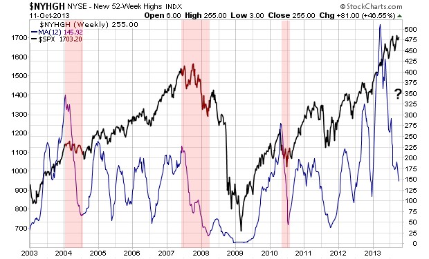
We must remember that investors as a crowd can be a very fickle bunch, especially over the short term. Investment attention shifts also between various investment drivers. For example, most often investors focus on company specific earnings when it comes to setting equity prices. But we know that lately in the US market, earnings and macroeconomic fundamentals are not the keynote drivers of equity prices. Rather, as I’ve written this year, the weight and movement of global capital have been the key drivers of this year’s investment outcomes. I believe the central bankers have finally gone too far setting global capital in motion, and thus scared Yen and Euro capital are migrating to the perceived safety that is the US dollar and US equities. This migration is supporting prices in the absence of meaningful earnings and/or revenue advances. This isn’t right or wrong, but worth remembering since no one metric drives asset prices at all times. And such is also the case with gold.

Some investors have purchased gold believing the US and the globe must return to some type of a monetary gold standard in response to the current ad hoc and unprecedented monetary policies of global central banks. Personally I assign zero probability to this as it would entail quick economic depression for so many economies. But that does not mean gold does not have a purpose.

Others have purchased gold convinced the US and other major economies are soon to embark on an inflationary spiral, with hyperinflation a possibility due to the magnitude of printed money in the current cycle. So far, that inflationary cycle has remained elusive as deflationary forces inherent in a debt deleveraging cycle have offset central banker otherwise inflationary actions. But that does not mean gold does not have a purpose.

Others have purchased gold, especially in the post 2008 period, as a “tail risk” hedge against broader financial markets. As you may remember from your college statistics class, the “tails” of the normal distribution curve, or bell curve, are areas of very low probability outcomes. In the financial markets, an example of a “tail risk” is a market crash. It’s just not something that happens frequently (although when one does occur, it’s not easily forgotten). After what occurred in the equity and credit markets from mid-2007 through early 2009, it’s only a natural that investors then incorporated some type of tail risk protection into portfolios. Now that equity and credit markets are back to all-time highs, with promises by the world’s top central banks to do “whatever it takes” by printing money to support economies and financial markets, the perception is that “tail risk” is much less of a threat than over the prior four years – or perhaps not a threat at all. Hence, there is the perception of a lessened need for gold in portfolios as financial disaster insurance. But that does not mean that gold does not have a purpose.

And still others have purchased gold as a hedge against systemic risk. We can all remember clearly the final days of 2008 and early days of 2009. Questions regarding the viability of the US banking system were very real. Fast forward to the present and the Fed has largely engineered the recapitalization of the US banking system via bond purchases, allowing the banks to earn an interest spread between the cost and use of their funds, clearly at the expense of depositors. For now, US banking/financial system systemic risk is off the table in the US. But that does not mean gold does not have a purpose.
So, are these the answers to the question, “What’s wrong with gold”? And if so, is it true that the gold bull market begun at the dawn of the last decade is over?

We need to remember that everything talked about above can be considered an abnormal, or “crisis” type of event (tail risk, systemic risk, etc.). Think back to the late 1970’s when US inflation was in double digit territory and gold was soaring. Investors at the time had never seen inflation rates like that. A crisis due to generational highs in inflationary expectations and real price pressures? Gold responded. Was Nixon taking the US off the gold standard in the early 1970’s a crisis? It may not have been seen as one at the time, but what followed was a drumbeat of successive country currency crises over the ensuing decade’s right up to the present. Gold responded.

In my mind, what’s wrong with gold is first that investor perceptions of a crisis probability is now low. Consider that this is a perception susceptible to change. The financial markets are characterized by changing investor “focal points”, or perceptions, over time. I’m convinced change in risk perception is short term, and has occurred due to unprecedented global central bank actions over the last 6-9 months. The consensus is that so long as the global central bankers are printing unprecedented amounts of money, the financial markets, banking systems and general economies are safe.

So where does this leave gold? My suggestion is that looking forward gold will now be much more of a barometer concerning confidence in central bank and political decision making – that’s its current purpose.

Prior to this year’s gold price correction, I sold half of the gold exposure in client accounts after holding positions for over a decade, in part due to the short term perceptual issues I discussed above. I remain convinced financial markets in 2013 are being driven by the weight and movement of global capital, specifically scared Yen and Euro capital moving into dollar denominated assets. When this occurs, the dollar strengths and the Euro and the Yen weaken. The rise in the Japanese Nikkei this year has much more to do with underweight global institutional investors jumping in. Domestic Japanese investors continue for now to invest outside of Japan. Global currency movements can also impact the price of gold over the short term. Historically, gold prices have moved inversely with the dollar. As global capital concentrates in the US dollar, the dollar rises in value. Again, history tells us a rising dollar is not a gold friendly environment, another part of the rationale for lightening up now.

Secondly, headline inflationary stats have been receding. Historically, gold has performed very well in a “negative real interest rate” environment. In English, that means interest rates below the rate of inflation. This year interest rates have held steady while short term inflation rates have fallen – in other words “real” interest rates have actually become “less negative”. Very short term, that’s less of a support for gold prices. Lastly, it was simply the realization that in any long term asset class bull market, assets need time to rest and time to consolidate before again moving higher. It’s simply time for gold to rest. So, is the more than decade long bull market in gold over? Although it’s mandatory to monitor as we move ahead, I’d suggest to you it’s not over by a long shot. Why?

The gold bull market being over would mean that central bank and political decision making ahead will be mistake free. That they’ll lead us all to the land of sustainable economic expansion with nary a bump in the road, and all prior issues related to global excess debt balances will be magically resolved to everyone’s benefit. If I truly believed that, I would have sold every ounce of gold we owned and be personally short gold. I’ve done neither, nor do I expect to any time soon.

What lies ahead that could potentially break investor confidence in central bankers/politicians, leading to a renewed attraction to gold as being a meaningful asset within a diversified portfolio?

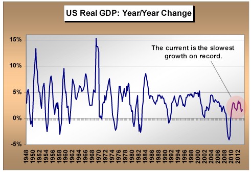
1) The US Fed has been printing money/expanding their balance sheet since early 2009. Since then they have printed close to $2.5 trillion. Since 2007, central bankers collectively have printed over $11 trillion. Unfortunately these Herculean efforts have not driven large global economies back to GDP trend growth. Growth rates in the current cycle are running at half the average of 1940-2008. Will printing another $1 trillion annually change this? How will this differ from the first $2.5 trillion of monetary expansion? And if economies do not reaccelerate, then what?

2) The Japanese are now intent on printing money at a rate twice that of the US Fed. This after more than two decades of economic deflationary pressure despite many prior money printing exercises by the Bank of Japan. Will the Japanese economy positively respond with this recent and most forceful monetary iteration? Moreover, in a current world of very slow to no growth in aggregate demand, will economic success in Japan simply be borrowing growth from another country or series of countries, in essence a zero sum effect for the global economy? If so, then what do central bankers and politicians do next?

3) So far, major developed economies have chosen to print money as a prescription for slow economic growth. What has been avoided is meaningful systemic reform accompanying the remarkable monetary stimulus. The need for reform has not disappeared, only been deferred. In the US this includes honestly and proactively addressing debt, deficit and entitlement expansion. All meaningful focal points of real reform have eluded Europe, the US and Japan. A failure to accomplish true economic infrastructure reform will mean the global money printing is for naught. Will this essential reform be accomplished and when will it start in earnest? Put otherwise, if central banks print historic amounts of money, yet politicians fail to enact needed reforms, which will alienate part or all of their political voter base – then what?

Remember, financial markets are not driven by a consistent and unchanging set of factors over time. Investor focal points change. For now the key focal point upholding investor confidence is the unprecedented magnitude with which global central banks are printing money, accompanied by promises to do more. But the core issues mentioned above have not magically disappeared. It’s in the reality of structural reforms where the real economic rubber meets the road. For now, global central bankers are being given “the benefit of the doubt” that all will end well. The thinking is that nothing can go wrong as long as money printing is in force. But for gold, that’s only half the equation.

We all know money cannot be printed indefinitely (especially in the magnitudes we see today) without adverse consequences to both financial markets and real economies. The real risk ahead is that reforms addressing debt, deficits, entitlements, currency infrastructure, and systemic risks will never occur. These require strong and decisive political thinking that translates into direct action. That’s where the real risk comes into play.

IF unprecedented money printing is not accompanied by successful and sustainable economic reform in the major developed economies over the next 12-18 months, gold will respond. That’s the investment thesis for gold as we look over the next few years.

How far could the price of gold fall before the current correction reverses? As always, it’s anyone’s guess and depends heavily on supply and demand balances. Although global demand for physical gold has remained incredibly strong, it’s the paper markets where we see the weakness. Gold near 1100 is not out of the question before this correction ends. But given the politically tenuous prospect for global economic reforms accompanying monetary policy across the planet, we may be looking at the final third of the secular gold bull market perhaps beginning sometime later this year or into 2014. The central bankers and politicians have so far inspired short term confidence in the financial asset markets. It’s now up to these politicians and central bankers to address the tough reform issues. If they do not, gold will have a purpose.